Loansifter Mobile: 40 Desktop Fields, 30 Seconds in the Field
I turned a legacy desktop pricing tool into a native iOS app for mortgage brokers. Research-validated information hierarchy shipped cross-platform and became the company's mobile foundation.
The Problem
Mortgage brokers lose deals when they can’t quote rates fast enough. During client meetings, at closings, on weekends, their only tool was a 40-field desktop pricing engine unusable on a phone.
This wasn’t about making a mobile version of the desktop tool. The desktop serves a 10-minute pricing session at a desk. Mobile serves a 30-second interaction in the field. Every design decision had to be filtered through that difference.
What I Owned
As the sole designer on a cross-functional team, I led the iOS application from discovery research through information architecture, interaction design, visual design, and development handoff. Weekly cadence with product managers. Direct coordination with legal on regulatory requirements.
Decisions That Shaped It
What goes on a single card?
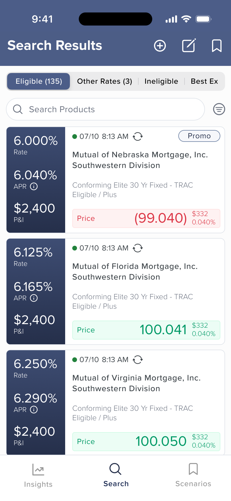
The desktop results view spreads a dozen data points across a wide screen. On mobile, each card needs to answer one question fast: is this product worth looking at?
I tested multiple card layouts across two rounds of research. The question was specific: when a broker scans 100+ products, what do they look at first? Initial discovery interviews shaped the first concepts. Preference testing of initial designs validated direction. A survey of ~100 core desktop users refined the hierarchy further.
Price won. It gets a color-coded indicator (green or red) for instant signal. Rate, APR, and P&I follow in a structured left column.
Getting ahead of a regulatory constraint
APR and Rate must receive equal visual treatment - a regulatory requirement in mortgage pricing. I’d seen this create problems on another product, where compliance flagged it post-launch and forced a rushed redesign. So I coordinated with legal before we’d even finalized the card layout.
That early conversation shaped the entire visual hierarchy. Rate and APR share typographic treatment in the left column, with Price differentiated through color rather than size. If we’d shipped with Price visually dominating Rate and APR, compliance would have flagged it and we’d have been redesigning under pressure.
Structuring 40+ fields for speed
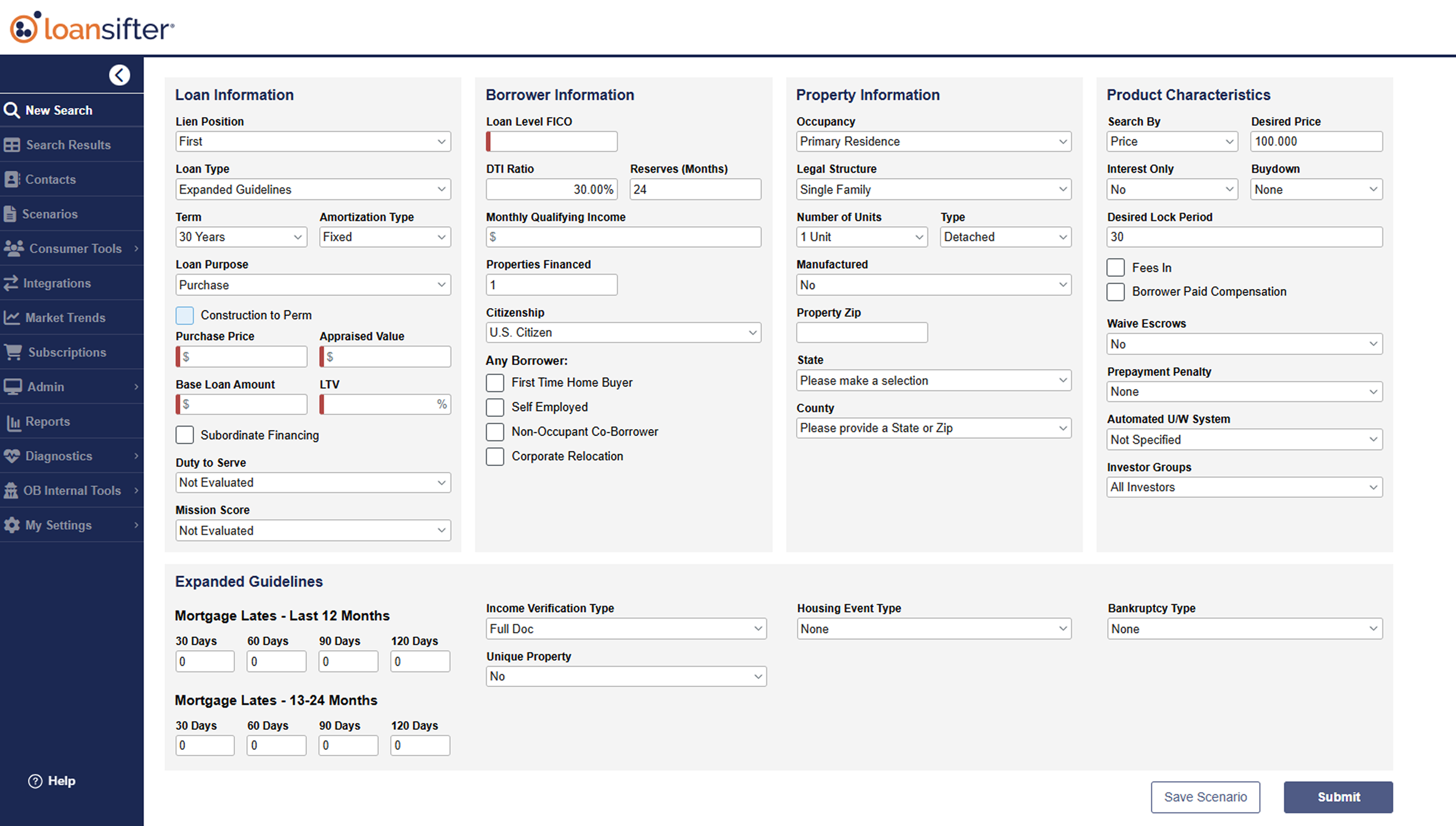
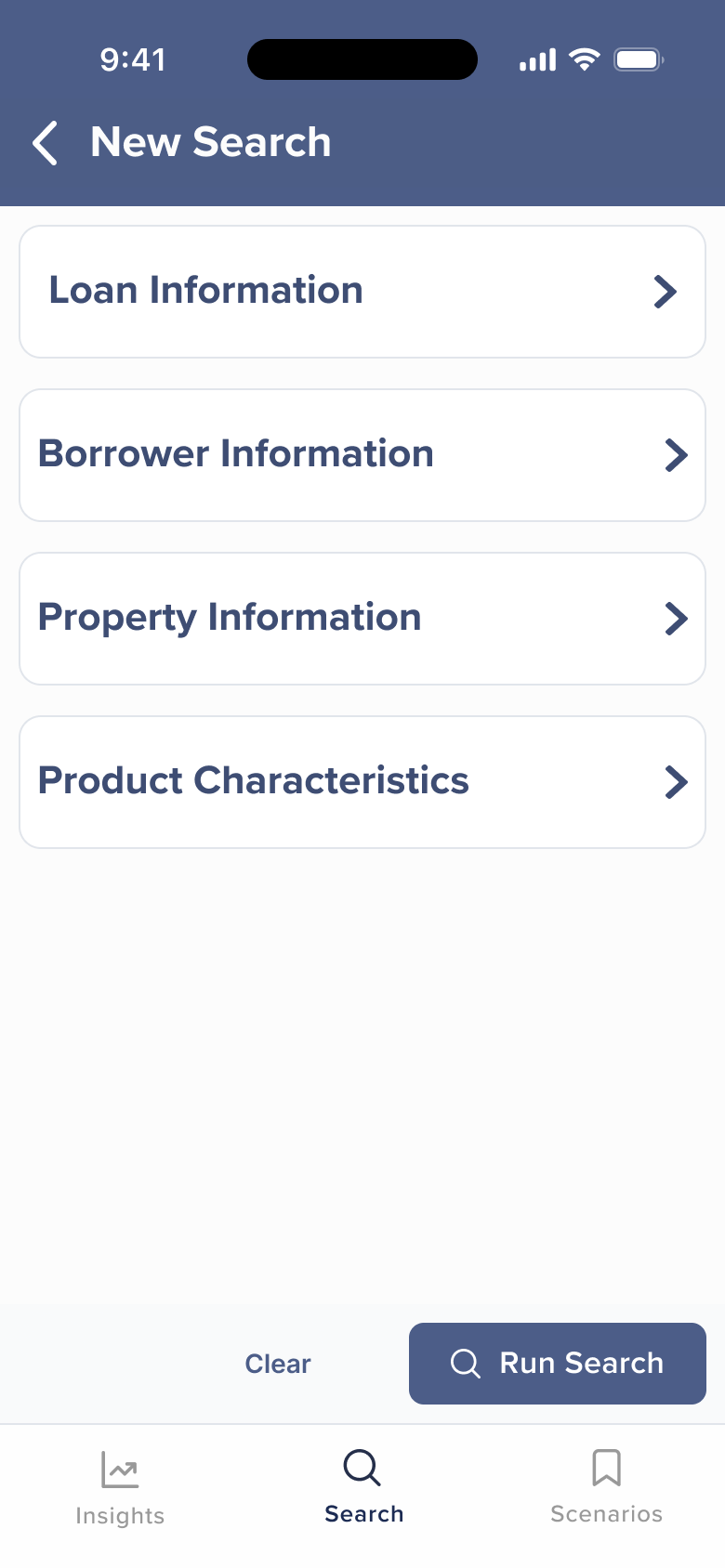
The desktop search form has 40+ fields across loan, borrower, property, and product characteristics. Porting that to mobile was a non-starter.
The alternatives (a single long scroll, a wizard-style multi-step flow) either buried fields or slowed users down. I restructured the form into four collapsible categories. Essential fields surface first. Advanced parameters are available but don’t block the common case.
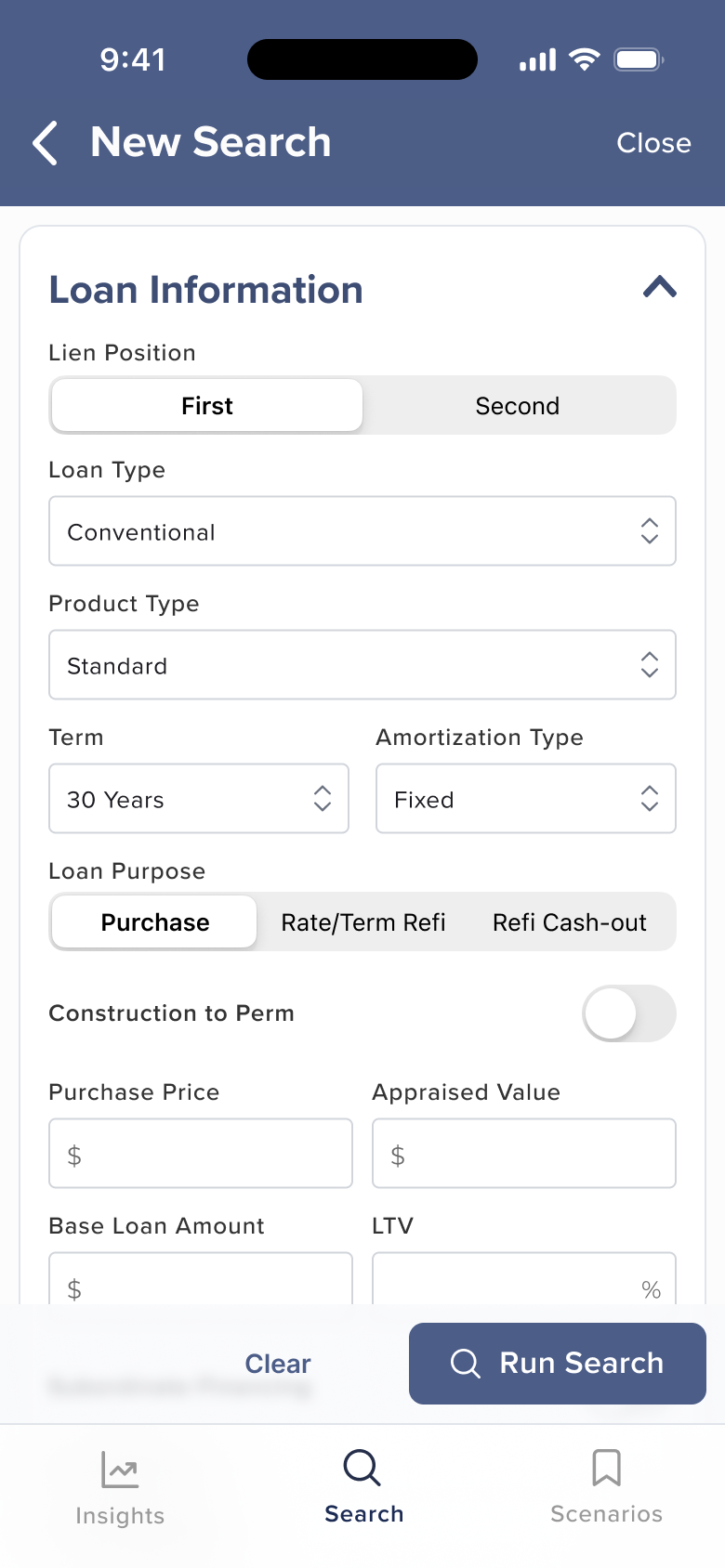
I also worked with Product to reduce which fields were required. A broker in the field can fire off a rough search with minimal input and refine later. A broker at their desk can use the full form. Same tool, two speeds.
In testing, brokers completed a basic search in under 40 seconds - validating that the streamlined form achieved the speed the field demands.
Finding the Right Weight
Product wanted increased prominence on certain result elements. I pushed back on density. With 100+ results in a feed, every pixel of card height matters. We landed on giving price the color-coded indicator and keeping rate prominent in the left column. Product got more visual weight; I held the line on overall card footprint.
Depth When You Need It
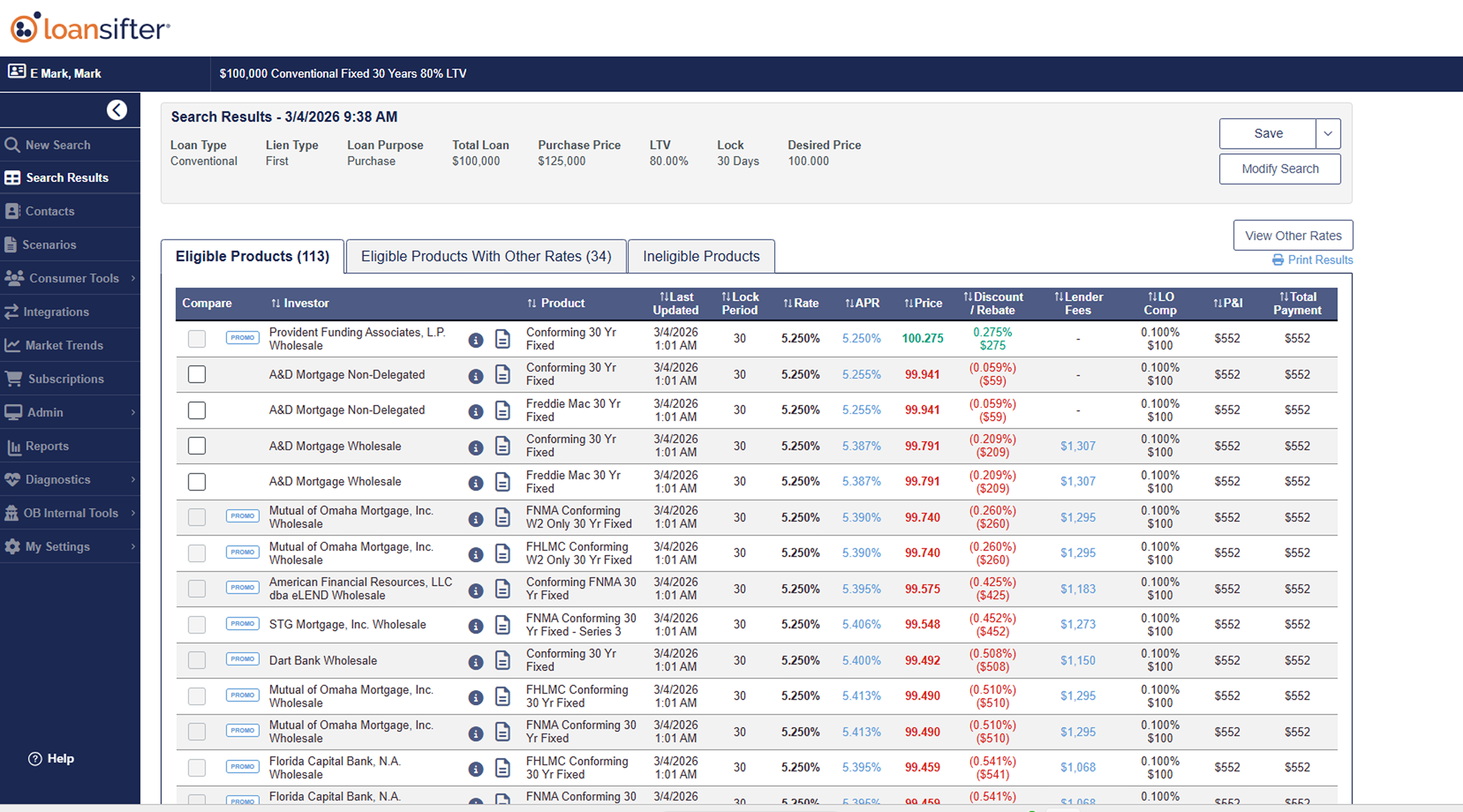
When a broker taps into a product, they need the full picture: rate, APR, price, discount/rebate, lender fees, P&I, total payment, adjustments, rate sheet.
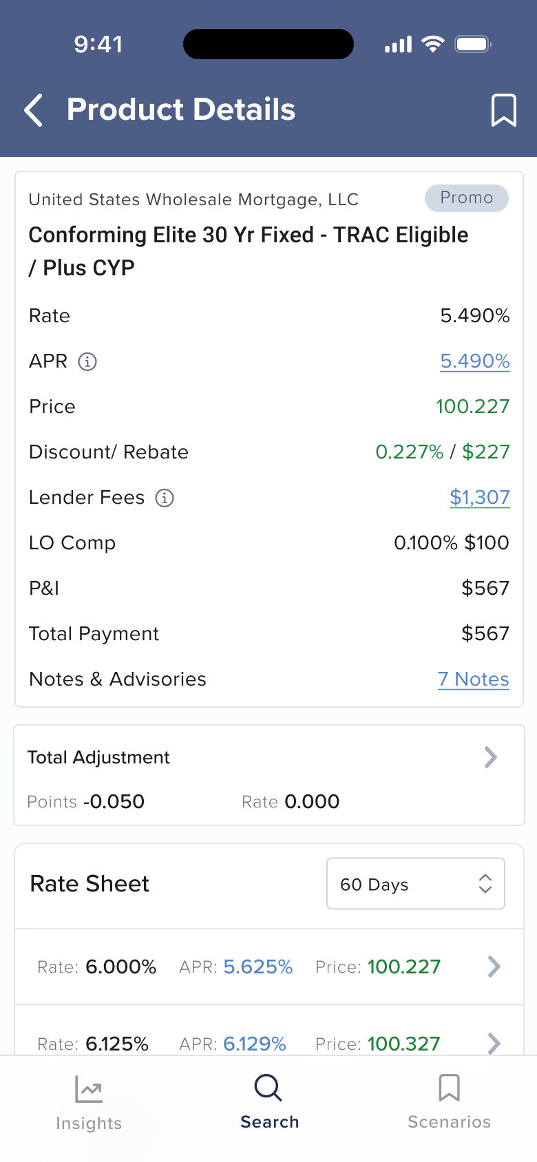
Total Adjustment shows the summary by default. Detailed adjustment reasons expand on tap. The Rate Sheet at the bottom lets brokers compare across lock periods without leaving the view. The pattern is consistent throughout the app: show what matters first, give full depth one tap away.
Design Principles
When specs are incomplete, research fills the gap. Specs were still in development when design needed to move forward. I used research findings to draft requirements and de-risk assumptions, then aligned with Product to refine scope. That’s how the project stayed ahead of schedule.
Mobile isn’t a smaller desktop. The core design challenge was resisting the instinct to shrink the desktop. The answer isn’t to cut fields. It’s to restructure around intent: fast search for the field, deep search for the desk. Same data, different moment.
What’s Next
The app is proof that Optimal Blue’s most complex pricing tool can work in a broker’s pocket. We’re currently testing the design and interaction patterns with a closed group of key clients before broader rollout. What comes next builds on that foundation: voice-assisted search input, expanded scenario management, and iteration driven by what adoption data tells us brokers actually need.